
Industry Insight
Creative
Company Culture
Access Brand Identity Evolution
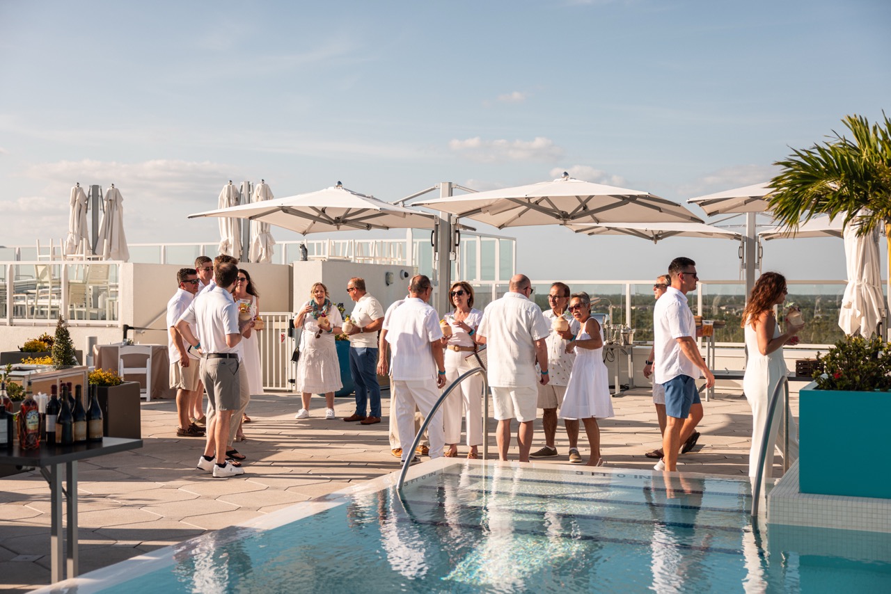
A strategy for success that's re-redefining the DMC industry (again).

In 2020, while the world was experiencing the pandemic and our entire industry was “on a break,” we were busy dreaming of the next vision for Access. After 50 years of redefining what it means to be a Destination Management Company (that’s DMC to those of us in-the-know!), we knew we had an opportunity to re-redefine and transform and elevate events. We were going to make the future by first making history.
Rebranding was a highway we were ready to take, to better display outwardly the transformation that had happened inwardly at Access. Under new, majority-women led and owned management, Access was poised to raise the bar on the creativity, professionalism and exceptionalism of what it means to be a DMC. Our rebrand was a passionate undertaking, as we knew it would be a powerful way to refresh our image, attract great talent, extend our client reach and differentiate us from the pack. At Access, we are committed to always being relevant and never boring!
"Under new, majority-women led and owned management, Access was poised to raise the bar on the creativity, professionalism and exceptionalism of what it means to be a DMC."
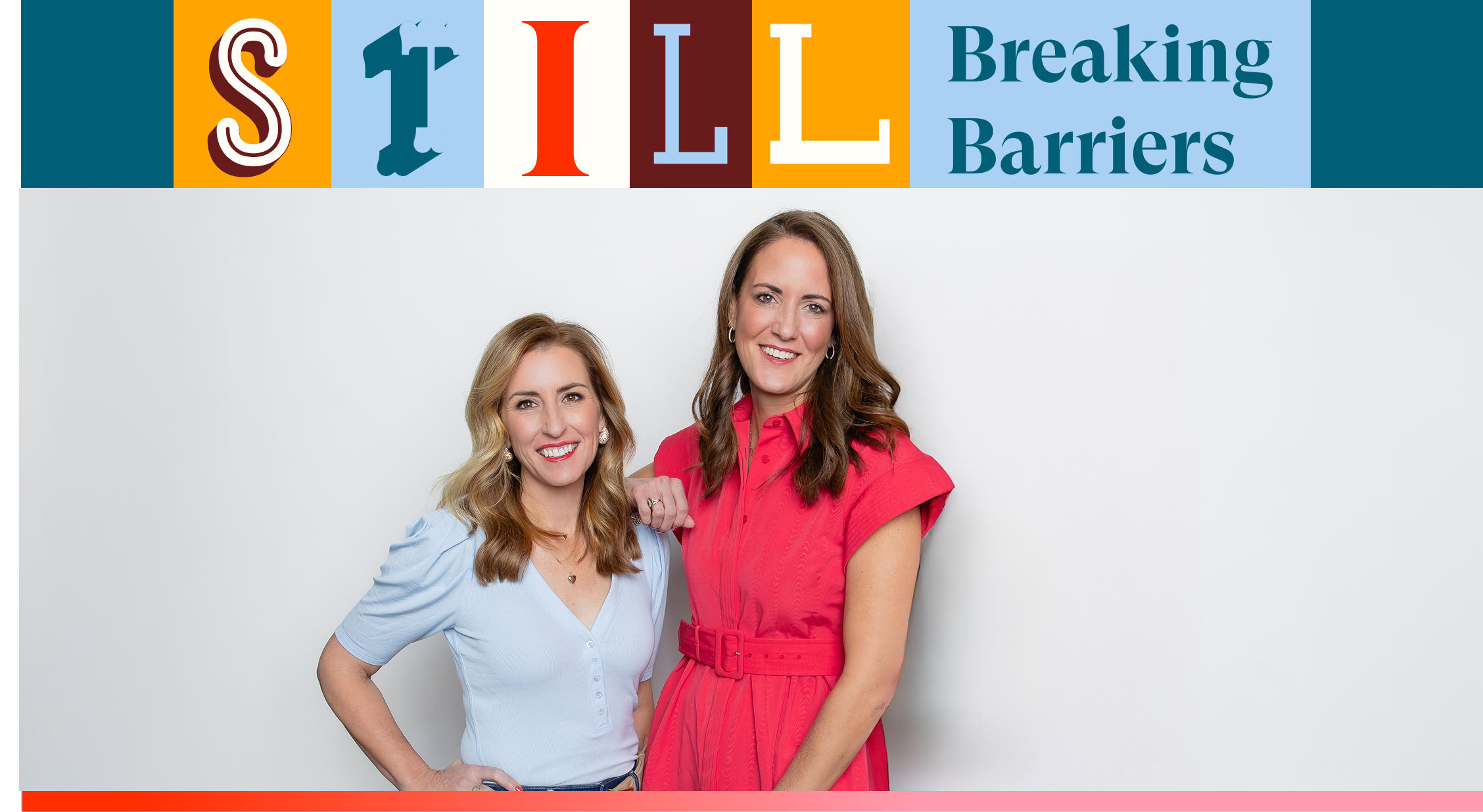
We enlisted the help of a talented agency, FRNDS (because who doesn’t want good friends?!), to support and guide us through our transformation. We knew we were still the company who delivered on our vision of inspiring people through shared experiences (it’s what we do, you know!?). What FRNDS did was help us better understand our tone, our connection internally and externally and they gave us some really cool and inspirational ways to engage with our team and our client audience. We have a story to tell, and they helped us tell it. We are professional but playful. We are tenured but always evolving. We are rooted deep with our commitment to our team, and yet we are firing on all cylinders when it comes to providing our clients with exceptional service and mind-blowing events. After many focus groups, client and team considerations, thoughtful and clever ideas, revisions and some web-site content heartache, we are proud to say we rose like a phoenix from the pandemic-ashes...better, stronger and dare I say, cooler.
Our visual identity, including our logo, color scheme, and other design elements, is a critical component of representing who we are. It reflects our brand values, personality, and audience, while also being distinctive and memorable. So, here’s what happened:
- We needed to refresh our image and up the ante in our industry, with a brand that was eye-catching and had meaning. Consider that complete!
- We knew we needed a color palette that represented the different styles and personalities of not only our people, but also of the coast-to-coast destinations that we service. Check!
- We also needed a single brand that we all would joyfully rally around for the Access battle cry. Done!
- We knew it was time to break away from the pack and establish ourselves as the undefeated industry leader. Accomplished.


No items found.
From the company who will never quit working hard for ourselves and our clients in all that we do, wrapping up our rebrand was the breath of fresh air we all were searching for. We will continue to go above and beyond the above and beyond, you can count on that.
Oh, and for those marketing geeks like me out there, here’s a little fun fact, the ‘A’ in Access displays the forward, upward movement of our company as shown in the point at the top of the ‘A’, and the special bond and connection we have with each other and our clients in the soft curve at the bottom. Oh, and flip it over, close the circle and you have a destination point that tells a part of the story of the impact we make across the country.
We’re really excited about the future of Access. Our brand perfectly reflects the next generation of cool stuff we plan to do. We’re on a 50-year roll, and honestly, we’re just gaining more and more momentum.


.png)


FAQs
No items found.